
I have had a blog entry in my drafts folder ever since the previous IWS website redesign… which went live in January 2012. I never finished it. Except for some tweaks here and there, the IWS website has not had a major redesign since then. That initiative took approximately a year to implement. Earlier this month, we significantly updated the look and feel of iws.edu. This refresh took about a month, so apparently we’re getting better at this! Hopefully, you’ll find the new site much more aesthetically pleasing. The updated typography and an overall more contemporary look should be an improvement, and we’ll continue tweaking here and there as we move forward. But this update was at least as much about how things work. So what’s new?
At the Top
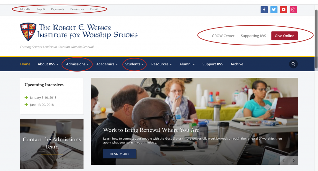
At the top, there are a few things to notice. Menus are better organized. We have Quick links at the very top for those things that you might come to our website to as a launchpad for other systems: IWS email, our online bookstore, the payment system, and Populi & Moodle. These links are convenient but take up very little room. On mobile, they’re just big enough to tap reliably. (Let me know if that’s not true!)
There is a new “Supporting IWS” navigation bar to the right of the logo. We rely on our donors’ generosity to keep our tuition affordable, so there’s a brightly-colored button to go right to the donation page. But there are other ways people can support IWS, and we want to call attention to those as well. We can dynamically adjust this bar to call out specific opportunities as needed. That kind of dynamism is going to be a recurring theme today.
Our social media icons are a little easier to find, and we’ve added our Instagram account. Our last design template didn’t have up to date icons for these services and didn’t even have an Instagram icon. We have updated the main navigation menu to make things a little easier based on user feedback. “Prospective students” becomes the clearer “Admissions” and “Student Life” is now “Students” to reflect all of the additions in that menu since 2012.
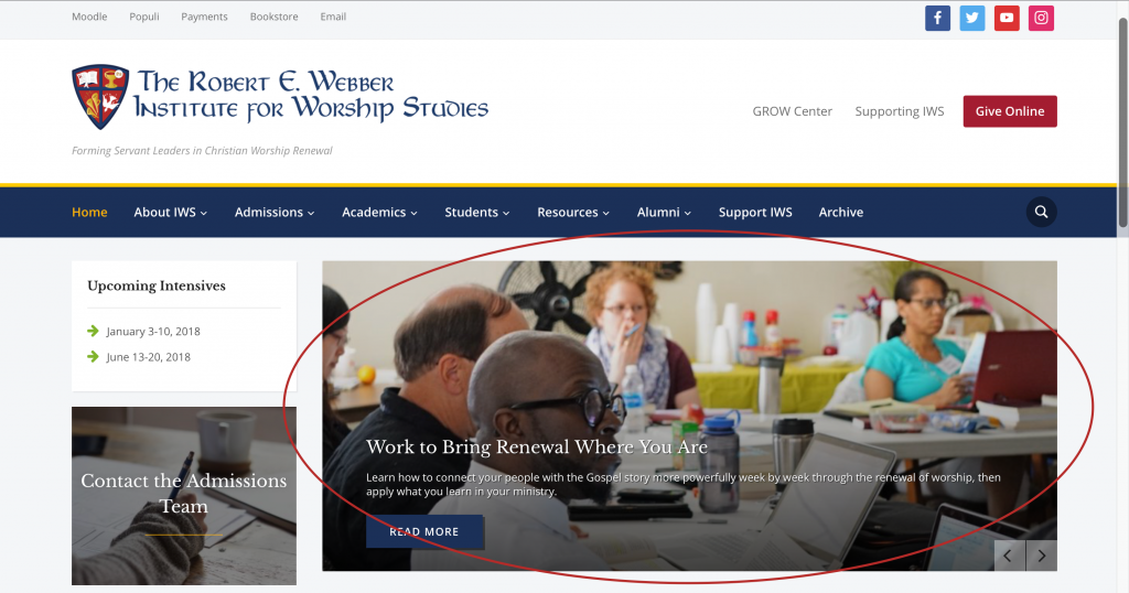
The slideshow now supports high resolution displays (like Apple’s “retina” screens). The updated code driving the new look will make it easier for us to promote recruiting materials to prospective students as well as highlight news and articles from faculty, students, staff, alumni, etc.
On the Side
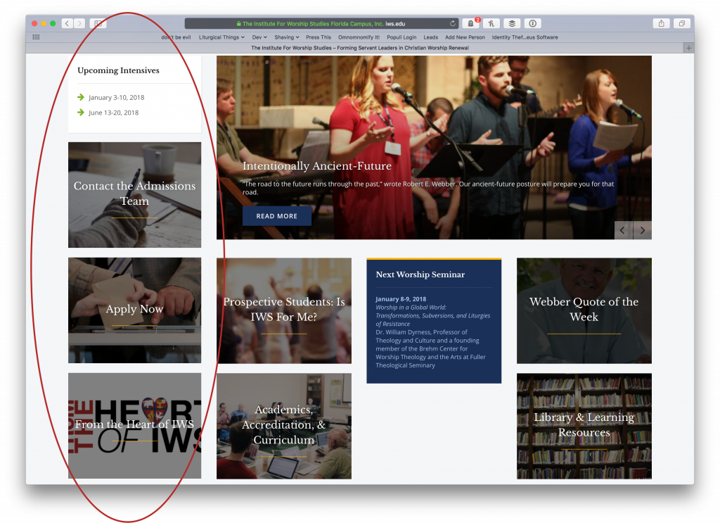
The left side bar, present not only on the home page but almost every post and page at iws.edu also, contains large tiles that contain important information or actions steps. These can be very easily adjusted on-the-fly as needed in different seasons. We hope this reduces the need to search for answers to frequently asked questions and the friction involved in helping people through the admissions process. I also expect that we’ll be able to find new uses for this area in the future.
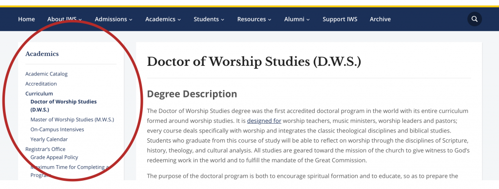
On pages other than the home page, we have greatly improved navigation within sections.
Dynamic Tiles on the home page
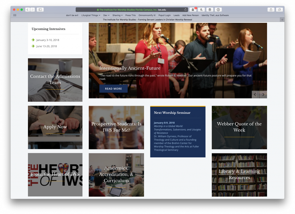
The primary content on the home page is a set of eye-catching tiles similar to the left sidebar. These tiles reflect the areas of our site that people frequently look for immediately after visiting the home page. While we want to make all information easy to find, we found a way to give priority to the most commonly-sought materials. We can adjust these seasonally as well to meet the needs of the school, staff, student body, and general public.
Below the tiles we have the same listing of news articles, blog posts, press releases, and more.
The text that comprised the body of the old home page has been transplanted to a page in the the Admissions section. Our site serves a much wider audience than prospective students, and we hope the new home page reflects that.
Mobile-friendly — finally!
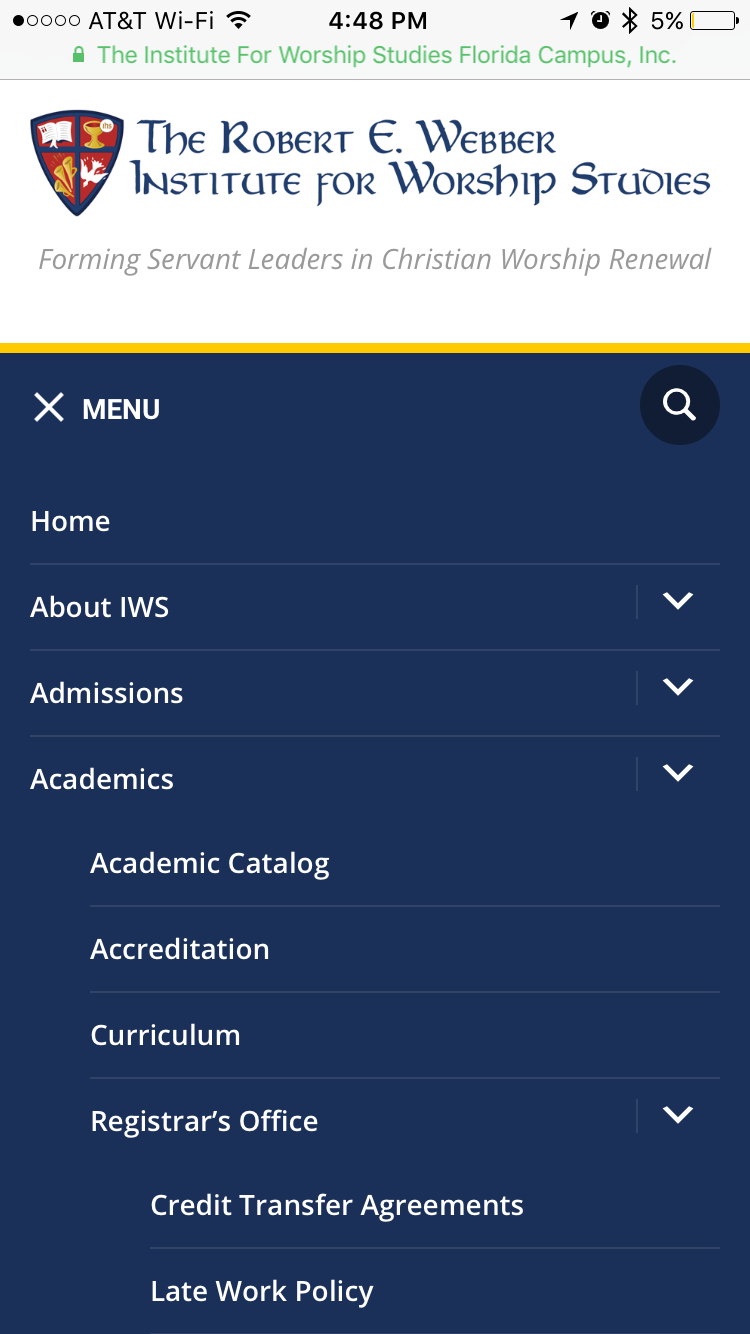
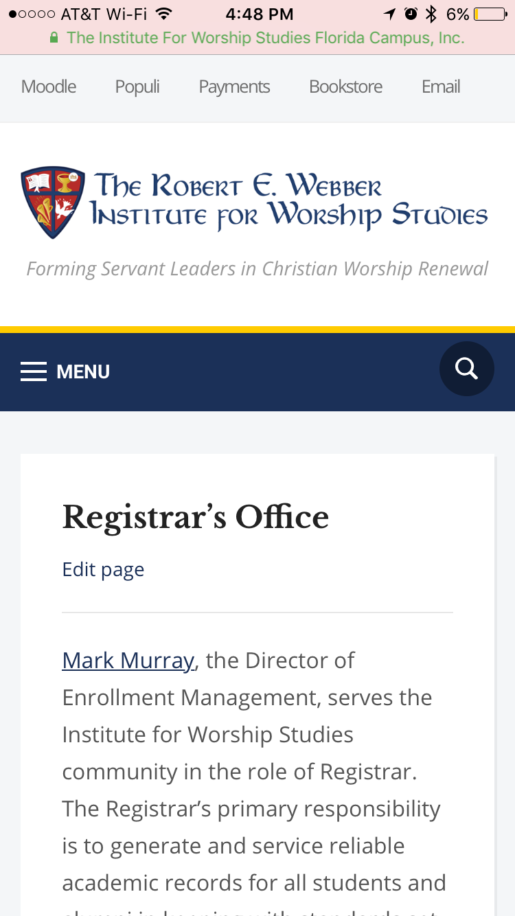

The new design layout is responsive to screen size–automatically. The complete navigation and quick links are available in their complete detail. Images and video get sized appropriately. And the system is smart enough to load the primary content at the top on smaller screens. Secondary content gets loaded at the bottom. If you find a device or size that looks out of whack, please let me know by email.
Behind the Scenes and Little Things
The new design template is compatible with WordPress’ built-in customization utility, meaning it is more easily customized and tweaked in big and small ways as needs dictate. The transition was also a good occasion to make other content more dynamic. For example, admissions forms now embed dynamically in the page when a prospective student clicks—no need to load a separate page just to ask a question or start the application process. Many of our testimonials pages will update dynamically from YouTube as we load new content there. Viewing the Quote of the Week archive shows a link to sign up for that email list. Long pages of text are replaced by tabbed pages (look at the curriculum page for example). We can also reuse content better when it must be repeated in multiple locations: for example, we post learning outcomes in the area of our site that lists various standards and assessment details for accreditation purposes. When they are from time to time updated, they automatically update in the curriculum area as well. Posting an important announcement—say, for a hurricane—is easier than ever before thanks to a new custom plugin. Many of our customizations that are independent of the look or design have been moved to their own new area, making future updates even easier.
Thanks
Thank you to everyone who helped me vet the new design, especially Jim Hart, Mark Murray, Kent Walters, Susan Massey, Sandy Dinkins, Christi Matteson, and Carol Hayes. They found numerous issues, big and small, in the preview version. I couldn’t have done it without them!
If you, dear reader, find any issues, please let me know and I’ll do my best to address them as soon as possible.